You’d think I’d have had enough of design shows after London Design Festival wouldn’t you? Nope, I’m still going strong. Anyway, I was in Amsterdam over the weekend for a blogging event and lucky enough to get to Woonbeurs, a Dutch home decor show.
The displays were simply fabulous. I was blown away by the Scandi-chic styling and creativity. Here are 10 ideas to steal for your own home:
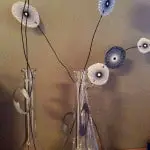
1. Skip the faux flowers and go straight to beautiful paper flowers in a vase. In this photo, I especially like that the flowers look hand drawn and hand cut.
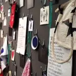
2. This picture gallery is installed floor to ceiling with items hung on hooks. If you don’t like something, you can always change it around. It would be especially effective with children’s art hung amongst other items.
3. How about wallpaper on a cupboard wall? It’s a new take on the feature wall. No need to worry about handles because simple finger holes are used to open and close the doors.
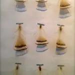
4. Decorative washi tape is used to hang up simple messages and objects. On the tablescapes, the pictures add depth behind the table. The feathers create an unusual geometric feature (as well as being in line with this season’s trends). You can have the tape blend into the scene or stand out as a feature as in the wall art. My favourite is the flower taped onto the flowered wallpaper. Only several of the flowers on the wallpaper were made into 3D effectively which emphasised the design even more.
5. I’m going to try this as a project with my daughter. Here, Japanese origami cranes are strung from chicken wire to create a simple mobile. I’m pretty sure my daughter will want to have colourful origami paper instead of the brown kraft paper used here. I’m looking forward to a lot of pink. This project would have you bang on trend as well because birds are a huge design statement this season.
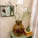
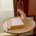
6. If you are feeling the need to create a neutral tablescape, take the cover off a couple of books. Books are wonderful for creating interest in a space but a busy cover can distract in a calm setting.
7. A mirrored kitchen island is a really clever way of enhancing light and space in a small kitchen. It does help if you don’t have children with grubby hands constantly around to ruin the shine.
8. Simple wood boxes in a child’s room are used to display their treasures.
9. Here a cloche, there a cloche, everywhere a cloche, cloche. Cloches seem to be everywhere this season. Seriously. you can put pretty much anything under a cloche or glass cover and the objects will seem important. Here, once again we see feathers and also a note. Simple everyday items put on display.
10. I’m sure you’ve heard designers bang on about open shelving being important in kitchens to add interest and warmth. If you still fancy a sleek fitted look, however, you may like this kitchen which has shelving and hanging rails built into the design.
Of the ideas above, six focus on curating objects, however simple, into a pleasing display. Yes, the art of display is another home trend. If you fancy yourself an artist or a collector, this season you can show off your styling skills. It’s a pretty easy skill to fake, however, just get yourself a cloche!


