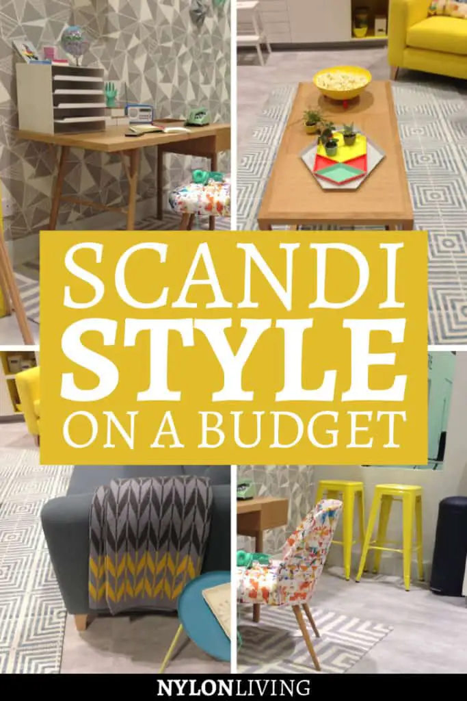
My favourite design-inspiration room set at Grand Designs last week was created by Maxine Brady, an interior stylist from Brighton. Entitled “Inspiration for First Time Buyers”, she has perfectly created a style-conscious, budget-friendly look in a limited space. The finished look relies heavily on the current trend fashion for mid-century modern furniture and Scandinavian style. The studio room works well because different areas are zoned for different uses but underlying themes and colours create a coherent look.
Kitchen/Dining
Although the colour scheme appears bright, the colour palette is very limited. She has used flashes of yellow to add interest to a predominantly grey and white neutral scheme. Having a base that is neutral with accessories in colour makes it easier to swap out items if you decide your space needs a revamp.
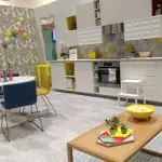
The Ikea dining table is based on an iconic Saarinen design. The chairs and the step stool are Ikea as well. I think the use of the Ikea kitchen is inspired as well. With a mix of flat fronts, textured fronts and open shelving, the kitchen looks very designer. The hexagonal wall tiles also are a very current trend. They are used in a small space and so give maximum impact for a limited budget.
Living Room
Pattern is also used throughout the space to add interest. There are lots of geometric prints but they don’t clash because of the restricted colour palette.  I love this table and the Hay nesting trays on it. Although not a cheap option (the Hay trays together cost about a £100), they are a design classic. In addition, buying good-quality accessories is cheaper than buying name-brand big items. They also elevate the rest of the space into looking more expensive than it really is.
Study Area
I love flooring which mimics poured concrete but are actually tiles. This floor is from Harvey Maria which is a cheaper option than Concreate for the budget-conscious. The look of the floor is warmed up with cozy patterned rugs. I also like how the sense of space in the room is highlighted because of the mid-century modern vibe of the furniture. The furniture is lifted of the floor on slender legs which visually adds space to the room. Everything seems collected and calm which goes well with the rest of the Scandi look. 
Like the look of mid century modern design? Spread the Word! Pin this to your Pinterest Boards for future reference!

The Scandinavian style is a favorite of mine. Combine it with a mix of mid-century modern
furniture and it’s even better. It’s a style that combine a white/grey neutral scheme with
details in bright yellow and geometric prints. However, designer pieces are often very
expensive. Check out some Scandi style inspiration for your house on a budget!
#yellow #geometric #midcenturymodern #scandinavian #design
This site generates income via partnerships with carefully-curated travel and lifestyle brands and/or purchases made through links to them.


