Bricks and stones won’t break my bones, but they can send me into a state of frenzy. The only way to not drive yourself crazy is to be fairly organised. First, though you need to come up with the inspiration! After all, you have to know what to organise.
I always envision what I want the living space to feel like. Our summer house is our haven where we escape the real world for a brief couple of months. I want our home to be a well-deserved break before heading back to school, work and the daily grind.
I find the colours of the beach take me to my ‘happy’ place. My inspiration board below reflects the colours of a New England beach and items washed ashore. I love the the muted tones of the blues and greens of the sea and beach glass and the greys and browns of driftwood and stones. These colours have a natural harmony which I find rejuvenating. Besides, on a practical note, we have renters and most people like natural colours.
This inspiration board will set the tone for the paint colours, furniture and accessories. I won’t replace our old furniture which some interior designers insist is necessary to get their vision right. I like my old stuff – it’s got nicks and scratches and associated good memories.
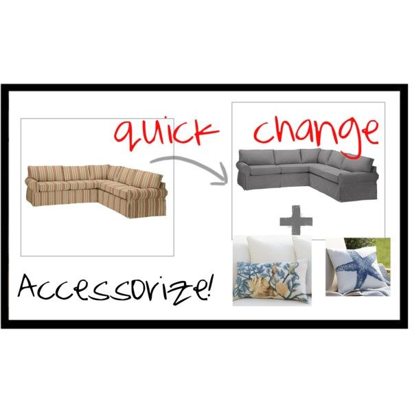
Although I find this photo amusing, abandoning old furniture into the woods in our back yard would only give the racoons a place to sit and watch us. I will try and incorporate existing pieces into the new scheme with some minor tweaking. For example, I have changed the slipcovers for the sofa from a cheery yellow stripe to a neutral metal grey colour. The sofa can be jazzed up with good accessories, such as pillows made in outdoor material which can stand up to the beating the children will give them.
You think with a limited palette of blue and green, sorting out the paint colours for the house should be easy. Nope. Who knew how many shades of misty greens and blues there are in the world??! I’ve limited myself to BenJamin Moore paints because I have used and liked this brand previously. Getting my beloved Farrow & Ball colours onto the Vineyard is an extra expense I can do without.
This colour board is where I’ve gotten to so far on the ground floor. I’m pretty happy with it but may still swap out a colour or two. I LOVE the Hidden Sapphire and think it would be a cool front door colour even thought I’ve gotten used to having a red front door. Traditionally, porch ceilings are painted the colour of the sky. I like Wythe Blue for the covered porch and the screened porch ceilings because it is not as icy as a true light blue.
I’m repeating most of these ground floor colours for the upstairs bedrooms. I like to have continuity in the house in terms of colour. Also, it’s a pain to keep track of too many bitty colours. I keep a note of each room and its colour for future reference for paint touch ups in the future.
I’m in two minds about putting Hidden Sapphire in Bedroom 1 in lieu of Saybrook Sage. It looks fabulous with the lime green curtains in the room and I’ve always liked the combination of navy and green. I’m afraid, however, it may look a little dark for the renters. Saybrook Sage is a safer choice and the room will just be fairly monochromatic in shades of green.
What do you think of these colours? I definitely reserve the right to change my mind as the renovation gets under way. Do you have any suggestions? I’d love to hear from you in the comments below.


