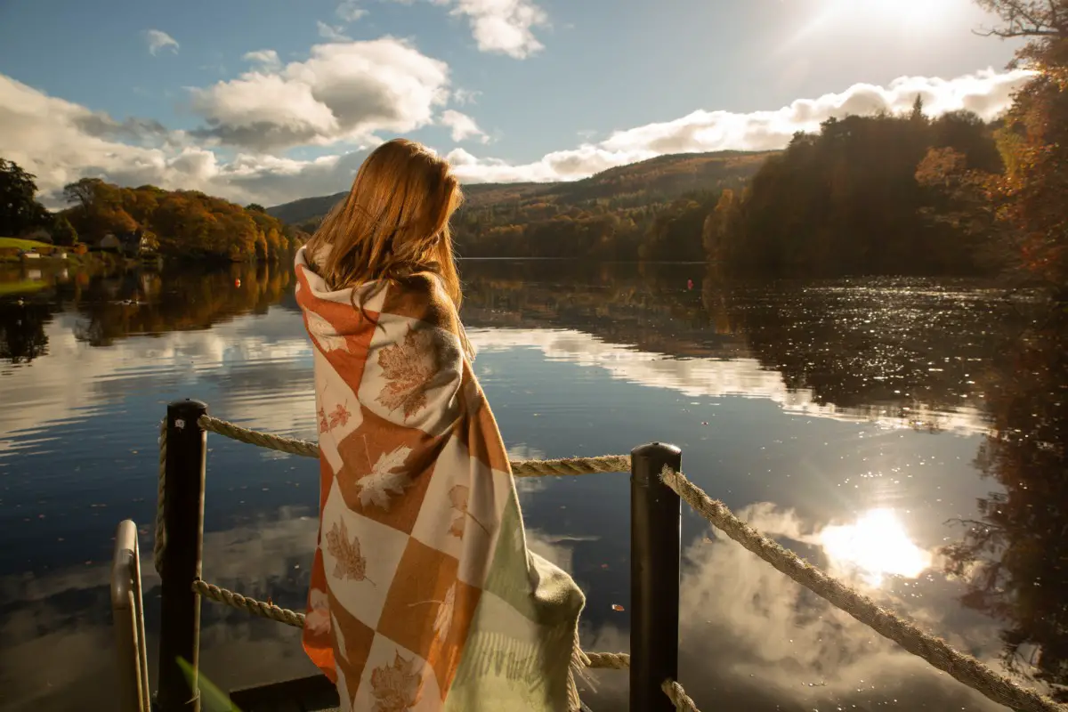
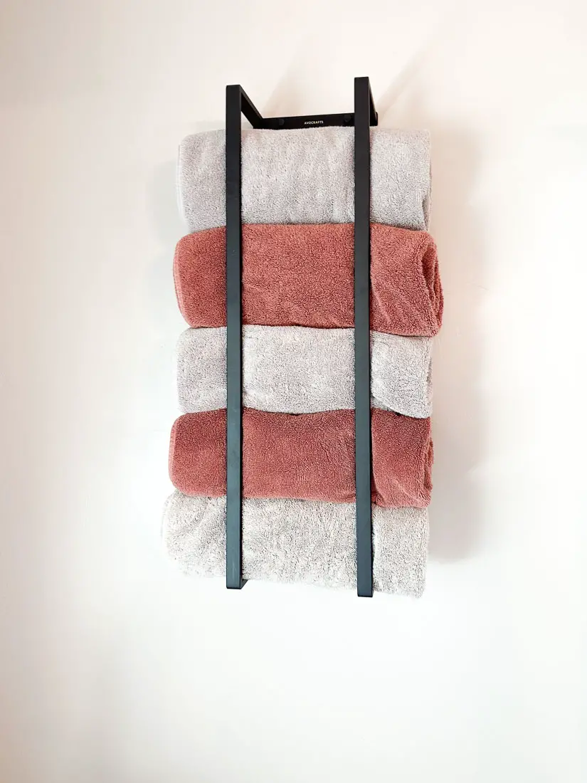
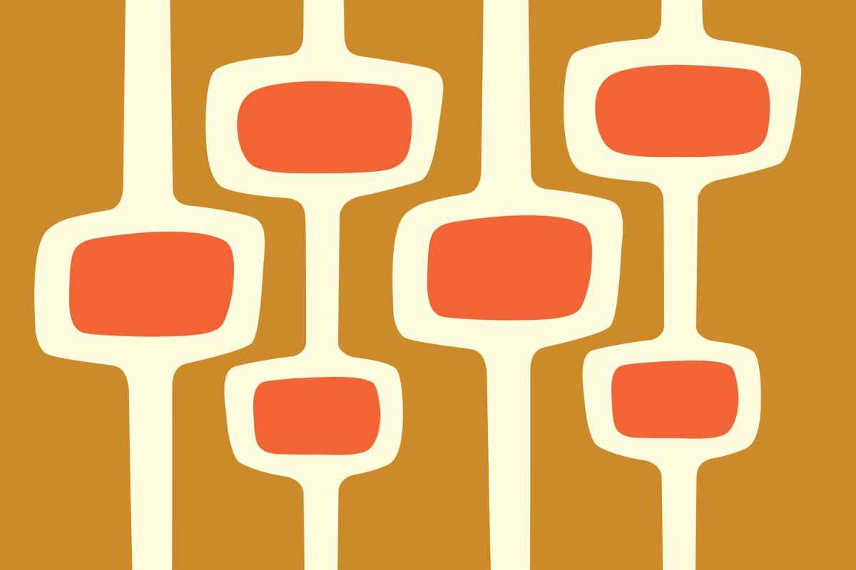
As a warm neutral, the color burnt orange works well with the current trend for earthy colors. Although burnt orange is an intense vibrant color, there are plenty of colors that go with burnt orange that can embrace a range of design styles from retro to cottage core and contemporary. Orange color palettes in interior design can create an inviting atmosphere while burnt orange accents clothes are great for the fall season.
What Color is Burnt Orange?
Burnt orange is a medium dark reddish-orange color that is associated with warmth, comfort and happiness. This color is also popular with sports teams. So burnt orange is also associated with strength and confidence thanks to the large amount of red that goes to make up the color.
Burnt orange was a popular hue in the 1970’s color palette. One popular look was pairing burnt orange with avocado green, mustard yellow and lots of brown corduroy.
Nowadays, the color burnt orange shows up as part of the seasonal change to autumn. With its evocation of warm wood fires, burnt orange conveys a feeling of warmth and coziness. Unless you are going for an intentionally retro look, keep the vibe contemporary by pairing burnt orange with fresh colors.
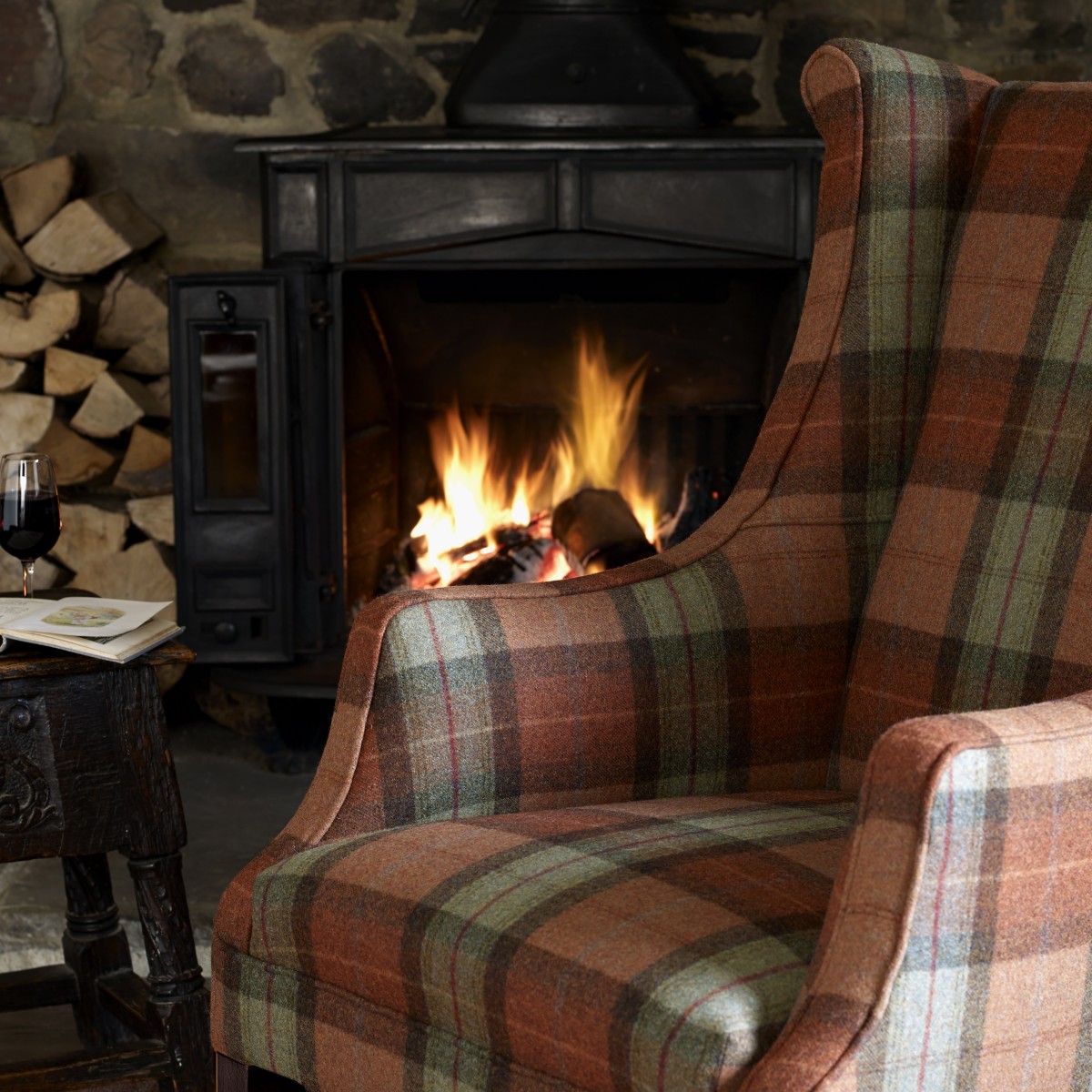
This armchair upholstered in burnt orange located near a roaring fire shows the inspiration for the color name (Image credit: Moon classics Collection)
As a natural earthy color, burnt orange is a versatile comfortable color but also has a zesty energy that is missing in other earthy colors. Vary the amount of pizazz you are looking for by making burnt orange either the dominant or the accent color.
Burnt Orange Color Code
Officially becoming a recognised color in 1915, burnt orange is a mix of red and yellow and may have a little blue in the color mix.
For example, both the versions of burnt orange used by Auburn University and the Denver Broncos have a bit of blue. Burnt orange also shows up as the school color for the University of Texas but without the addition of any blue.
The hex code for burnt orange is #CC5500 which consists of 80% red, 33.3% green and 0% blue.
Burnt Orange Pantone
The burnt orange color code assigned by Pantone is #c7622b. Burnt orange Pantone has a bit of blue making up the color.
Burnt Orange Color Theory
Burnt orange is a warm color that can be not only bold but also versatile in your color palette. When choosing colors that go well with burnt orange, consider complementary, analogous, or neutral color schemes.
Here are some color combinations to consider:
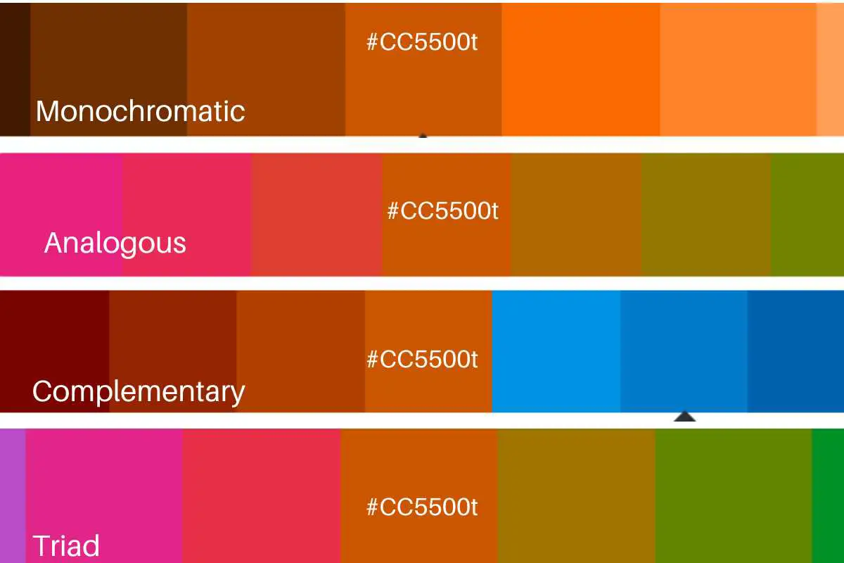
Monochromatic colors are different shades of the same color ranging from darker to lighter shades. You get shades of burnt orange by adding black to a color. A monochromatic color scheme burnt orange can get as dark as an espresso brown.
Other useful elements of color theory that you can try include analogous colors, complementary colors, split complementary colors and triad colors.
Analagous Colors for Burnt Orange
Analogous colors are near other on the color wheel and provide a visually soothing color scheme.
For burnt orange, which is a shade of orange, the analogous colors would be other orange hues and the neighboring hues.
The analogous colors for burnt orange could include acid green and red.
Using analogous colors in a design or composition can create a sense of harmony and cohesion, as they share common undertones and evoke a similar mood.
Complementary Colors for Burnt Orange
Complementary colors go together because they are on the opposite each other on the color wheel. A complementary color scheme has a high contrast and catches a viewer’s attention.
Since burnt orange is a shade of orange, the opposite of burnt orange is a shade of blue. Spanish blue (#0068BF) would be the complementary color to burnt orange. When placed together, complementary colors create a strong contrast and can make each other appear more vibrant and intense.
Split Complementary Colors for Burnt Orange
Split complementary colors are the two colors on the opposite side of the complementary color (i.e., the ones right across from burnt orange on the color wheel).
The split complementary colors for burnt orange are Tiffany Blue (#00BFB7) and Medium Blue (#0008BF). These colors create a balanced and visually pleasing palette that combines the boldness of complementary colors with the harmony of neighboring hues. The use of contrasting colors makes a burnt orange color palette pop.
Triadic palette for Burnt Orange
A triadic palette are three colors evenly spaced out on the color scheme. In the case of burnt orange, a triadic palette is created with Go Green (#00BF57) and Interdimensional Blue (#5700BF).
Tints and Tones of Burnt Orange
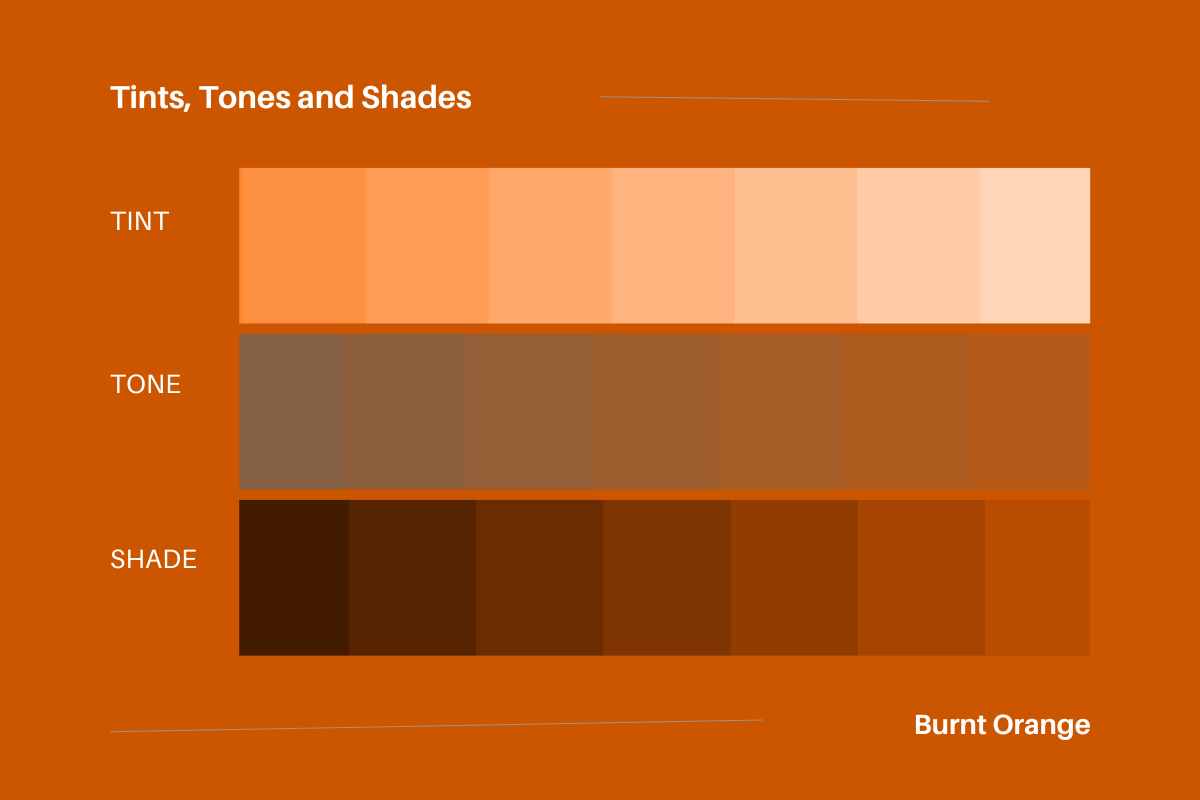
You get tints of burnt orange by adding white to the color, tones of burnt orange by adding grey to the color and burnt orange shades by adding black to the color.
25 Perfect Color Combinations for the Color Burnt Orange
For such a vibrant color, there really are a lot of color combinations for the color burnt orange.
Blues and burnt orange
On the color wheel, the color opposite orange is blue. Burnt orange and brighter blues like royal blue are a popular mid-century modern combination.
Navy blue and burnt orange create a striking contrast together. The burnt orange color scheme should be based mainly on navy blue with accents of burnt orange. The deep, cool tones of a dark color like navy blue makes the vibrancy of burnt orange pop.
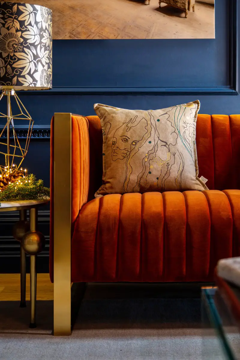
One of the best colors that work together are navy blue and burnt orange (Image credit: The Monkey Puzzle Tree)
Check out the Cabana Bay Hotel decor in Orlando for how teal and orange works together. In this iteration, teal is the main color and pops of color are added by burnt orange.
Of course, you can do the reverse as well. In that case, burnt orange would be the dominant color and is accented by pops of teal, turquoise or aqua. Burnt orange adds warmth, while a dark teal would be a grounding influence.
Burnt Orange and Other Earthy Colors
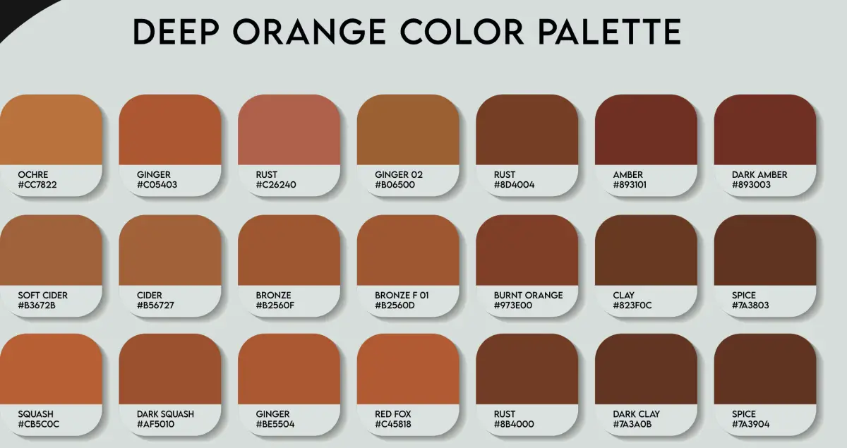
You can pair burnt orange with other shades of orange in a monochromatic look. The danger is that with so much vibrancy the overall effect can be flat. Shades of terracotta or peach, could add a more dimensional look to the color palette.
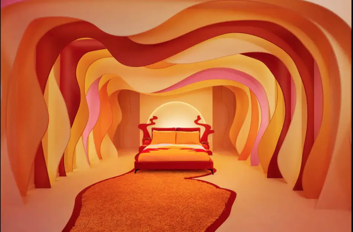
A bedroom envisioned by House of Sunny makes a bold statement with burnt orange walls and burnt orange furniture (image courtesy of AirBnB)
Earthy colors like terracotta, mustard yellow, and olive green go well with burnt orange to create a natural and warm look. Unless you want that look, be careful not to venture into 70’s territory. You can avoid going into a time warp by using modern fabrics and textures (like boucle!) to bring it firmly into this century.
Burnt Orange and Greens
Forest green and burnt orange is a playful combination highlighting the warmth of forest green as a color
Olive green has muted warmer undertones than forest green. The softening effect of olive green pairs well with spicy burnt orange.
The vibrancy of burnt orange paired with dusty sage green creates a warm yet sophisticated feeling. Think cozy grandmillenial meets a chic coastal grandma aesthetic.
Soft and fresh, mint green goes well with warm and bright burnt orange to create a modern and sophisticated look.
Burnt orange and emerald green are both vibrant colors which together brings a zesty energy to any color palette.
Burnt Orange and Purples
As analogous colors, burnt orange and dark purple go well together. These two colors can also veer into retro territory.
For a modern look try burnt orange and plum both of which are rich colors with warm undertones or even mauve, a blue/purplish color.
Burnt Orange and Browns
As shown by the monochromatic color scheme, burnt orange and browns are a natural classic combination.
Neutral colors like cream or beige can balance the boldness of burnt orange and create an elegant, subdued look.
What’s the difference between beige and cream you may wonder?
Beige is a sandy yellowish brown with cooler undertones, while cream has warmer brown undertones. Beige, a cool color, goes well with pretty much every color because it’s so … beige. Burnt orange saves beige from being bland.
The brown undertones of cream make it pair beautifully with burnt orange. Tone down the intensity of burnt orange with a a darker brown like a taupe. Try a warm taupe that complements the warmth of burnt orange but has more gray and brown undertones.
Since both the colors of beige and taupe are warm, they create a neutral and calming environment where burnt orange can add a pop of clot.
Burnt Orange and Neutrals
Burnt orange adds dynamic energy to neutral tones like grey, black and off-white. Although burnt orange packs more punch than other neutral colors, it can work as a psuedo-neutral color because it iis still a grounded earth color.
The warmth and vibrancy of burnt orange works with cool gray tones to create a modern look and an excellent choice to add a pop of color.
Even though burnt orange and black are Halloween colors, they can also be used together to create a sophisticated look.
For a high contrast look, pair burnt orange and white. Keep the harmony by making sure it’s an warm off-white.

Burnt orange and white is a crisp and clean color combo (Photo by Dylan Spout on Unsplash)
Burnt Orange and Gold
Metallic accents like gold or brass can add a touch of luxury and sophistication when paired with burnt orange. This color combination works because burnt orange is very close to a copper color.
Burnt Orange and Pinks
Pairing burnt orange and bright pink is a contemporary and bold color scheme. Alternatively, try 2023’s color of the year magenta with burnt orange for a cool boho look.
Alternatively, opt for a vintage cottage-core look by using burnt orange and dusty pink. Blush pink and burnt orange also shows up in a Scandinavian-inspired color palette.
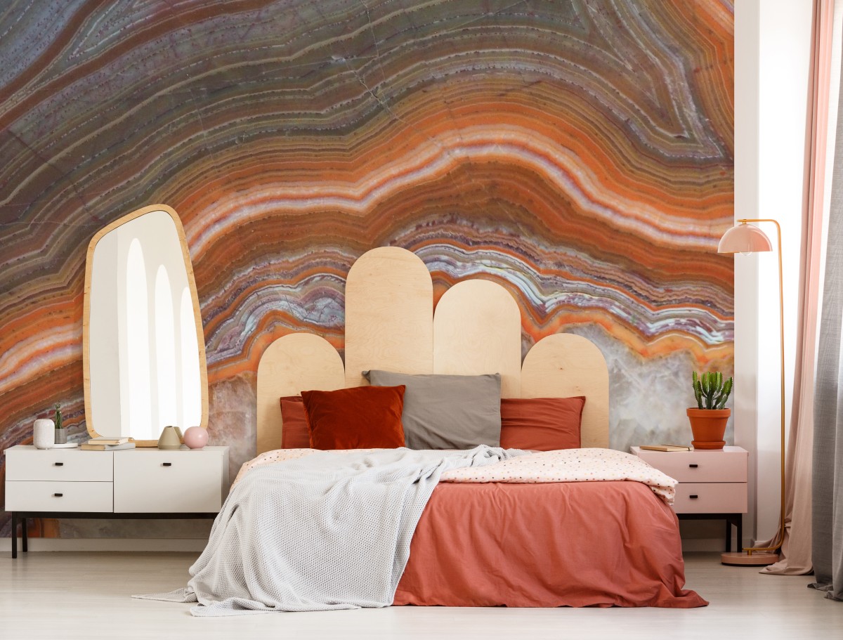
Marble Wallpaper Mural – ‘Orange Geode’ makes a focal point for the room as wall art (Image credit Wallsauce.com)
Like the look of the color Burnt Orange? Spread the Word! Pin this to your Pinterest Boards for future reference!
We did not receive compensation of any form, monetary or otherwise, from any of the products, services, hotels etc mentioned in this article.
This site generates income via partnerships with carefully-curated travel and lifestyle brands and/or purchases made through links to them.
